“The room environment is the primary thing that determines what the screen looks like.”
Today it’s 200 “just for diffuse white.” Tomorrow it’s 1,000 “for speculars.” Next week your UI has gradients.
If it needs to “punch through,” perhaps it should consult a therapist.
We love HDR as a container the way we love empty boxes: stackable, reusable, and best when not overfilled.
If the intent can’t survive at 100 nits, it wasn’t intent. It was exposure compensation.
Curtains are the most underrated color-management tool.
If you raise the peak, you must not also raise your sense of self.
Brightness is a capability, not a commandment.
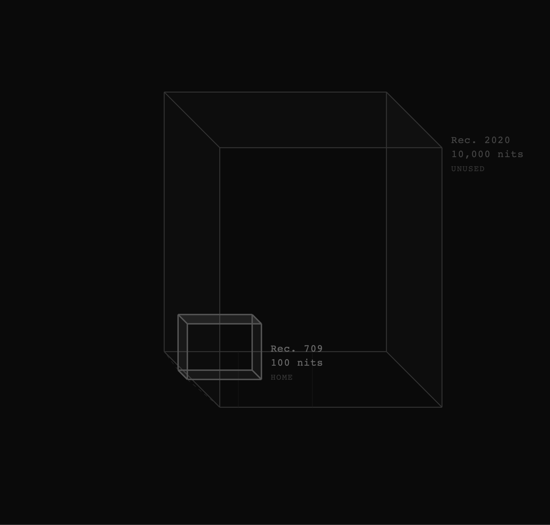
The PQ100 color volume. Everything outside the inner cube is someone else’s problem.
“Tone mapping is a marketing scam.”
We calibrated two professional mastering monitors — one fed an HDR signal, one fed SDR — and graded them to look identical. Then we pointed at them. The audience was convinced. So were we. Science.
SDR · 100 nits
HDR · 100 nits
Drag to compare. Left: SDR at 100 nits. Right: HDR at 100 nits. Notice the preserved creative intent.
Real-world examples of HDR done right — which is to say, done so it looks exactly like SDR.
The cinematographer requested that no frame exceed 103 nits. The colorist honored this by grading in SDR and wrapping it in a Dolby Vision container. Audiences reported “a cinematic experience,” unaware they were watching SDR. Peak creative intent.
MaxCLL: 101 nits · MaxFALL: 47 nits · Viewer complaints: 0 (that we counted)
A cautionary tale. The director insisted on using 600 nits for a sunset scene. Test audiences described the image as “too vivid” and “suspiciously lifelike.” The scene was re-graded to 98 nits. The sunset became a suggestion of a sunset. Critics called it “restrained” and “intentional.”
Original MaxCLL: 612 nits · Corrected MaxCLL: 98 nits · Festival awards: 2
Every episode takes place in near-total darkness. The HDR grade uses the PQ curve exclusively to encode values between 0.001 and 4 nits. Technically, this is the most efficient use of the format we have ever documented. The show is unwatchable in any environment containing a window. We consider this a feature.
MaxCLL: 4 nits · MaxFALL: 0.8 nits · Curtains required: Yes
“If both are presented at the same brightness, SDR can be just as bright and punchy.”
Content that has been verified to contain no perceptible difference from its SDR deliverable earns the PQ100 Certified badge — the industry’s only guarantee that your HDR investment produced no visible result.
A compliant waveform. Note the vast emptiness above 100 nits. This is not wasted space. It is reserved for future regret.
Our condolences.
Storytelling survived Shakespeare performing by candlelight. Your corporate sizzle reel will survive 100 nits.
We do not acknowledge the pupil.
We are in active litigation with Sky UK.
Spatial contrast is a theory. 100 nits is a fact.
That’s not a question. Also, viewers prefer many things that are bad for them. Highlights. Sugar. Gradients.
They are large. There is a difference.
That’s not creative intent. That’s lifestyle inflation.
We appreciate the effort, but the simplest way to preserve creative intent across display capabilities is to not use any of them.
Curtains, blackout blinds, strategic furniture placement. The viewing environment is the first and last line of defense against unnecessary brightness. We have a whitepaper on this. It is 40 pages long and contains no images, because images might exceed 100 nits on your screen.
Absolutely not. We are deeply committed to the preservation of the 100-nit creative intent that has defined cinema since the medium was projected at 48 nits in a dark room and everyone agreed it was fine.
“HDR is a data hog.”
“I graded the entire series at 97 nits. The client asked if the HDR was broken. I told them it was perfect. They believed me.”
— Anonymous Colorist, Major Streaming Platform
“Once I stopped using anything above 100 nits, I finally understood cinema. And also, my electricity bill went down.”
— PQ100 Certified Colorist
“We wrapped the SDR grade in Dolby Vision metadata and shipped it. Nobody noticed. We got renewed for a second season.”
— Post-Production Supervisor, Redacted
“HDR is like a bigger house. Sure, you could use the extra rooms. But have you considered just not?”
— Keynote Speaker, PQ100 Summit 2025
Our research is grounded in a rigorous misunderstanding of human visual perception.
The human eye adapts to any brightness level. Therefore, all brightness levels are the same. This is basic neuroscience. If you show someone an image at 100 nits and then the same image at 1,000 nits, after sufficient adaptation time (we recommend 45 minutes in a sealed, lightless room), the viewer will report no preference. We consider this proof.
Some researchers claim that bright highlights cause intraocular light scatter, altering perception of the entire image. We address this by ensuring no highlights are bright enough to scatter. Problem solved at the source.
The Perceptual Quantizer is an elegantly designed transfer function that maps human contrast sensitivity across a luminance range of 0.0001 to 10,000 nits. We use approximately 1% of it. The rest is reserved for future generations, who will also not use it.
Cinema projection peaked at 48 nits. Every great film you’ve ever loved was mastered for a system that would fail PQ100 certification only because we hadn’t invented it yet. The entire history of cinema is our evidence base. You’re welcome.
For the PQ100-compliant workflow.
Blackout. Floor to ceiling. The foundation of any serious color-managed viewing environment. More effective than any tone-mapping algorithm and significantly cheaper than a Barco Lightsteering projector.
If the needle moves past 100, you’ve failed. Recalibrate your life.
Caps HDR at 1,000 nits, but we recommend setting it to 100 and using the remaining 900 nits as a buffer zone for creative intent you will never exercise. Pairs beautifully with the philosophy that the best use of modern display technology is to accurately reproduce 1970s projection constraints.
The only transfer function you will ever need. Some call it a display EOTF. Others call it a color space. We call it both, because precision is the enemy of vibes.